ZEISS Figma library transition
2023/2024

While working for ZEISS, I was part of the “Beyond for online” design team, creating guidelines and assets for online experiences at ZEISS, for example website components. The beyond online team transitioned older design libraries and their components from Sketch or Adobe XD to Figma while simultaneously reviewing their design and usability to rework them.
Overview
- Component design: Created fully responsive Figma components and prepared their documentation and presentation for the Beyond for Online Experiences website.
- Interaction design and prototyping: Enhanced components with interactive behaviors and variants in Figma, enabling them for usability testing and design validation.
- Design evluation and development review: Collaborated with ZEISS designers and art directors to review and validate component designs. Guided developers during implementation, provided design support and conducted final design reviews.
Component library at ZEISS
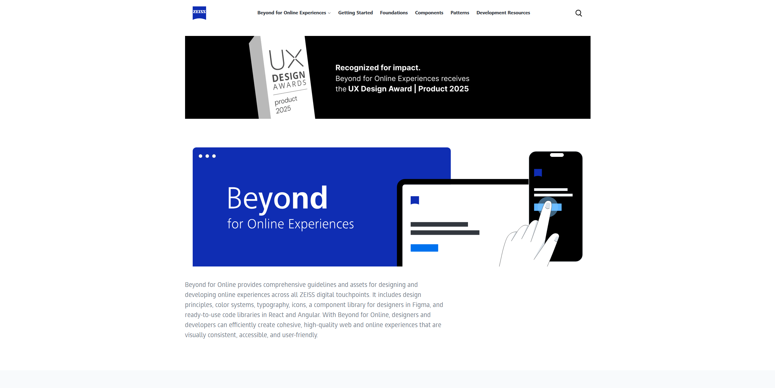
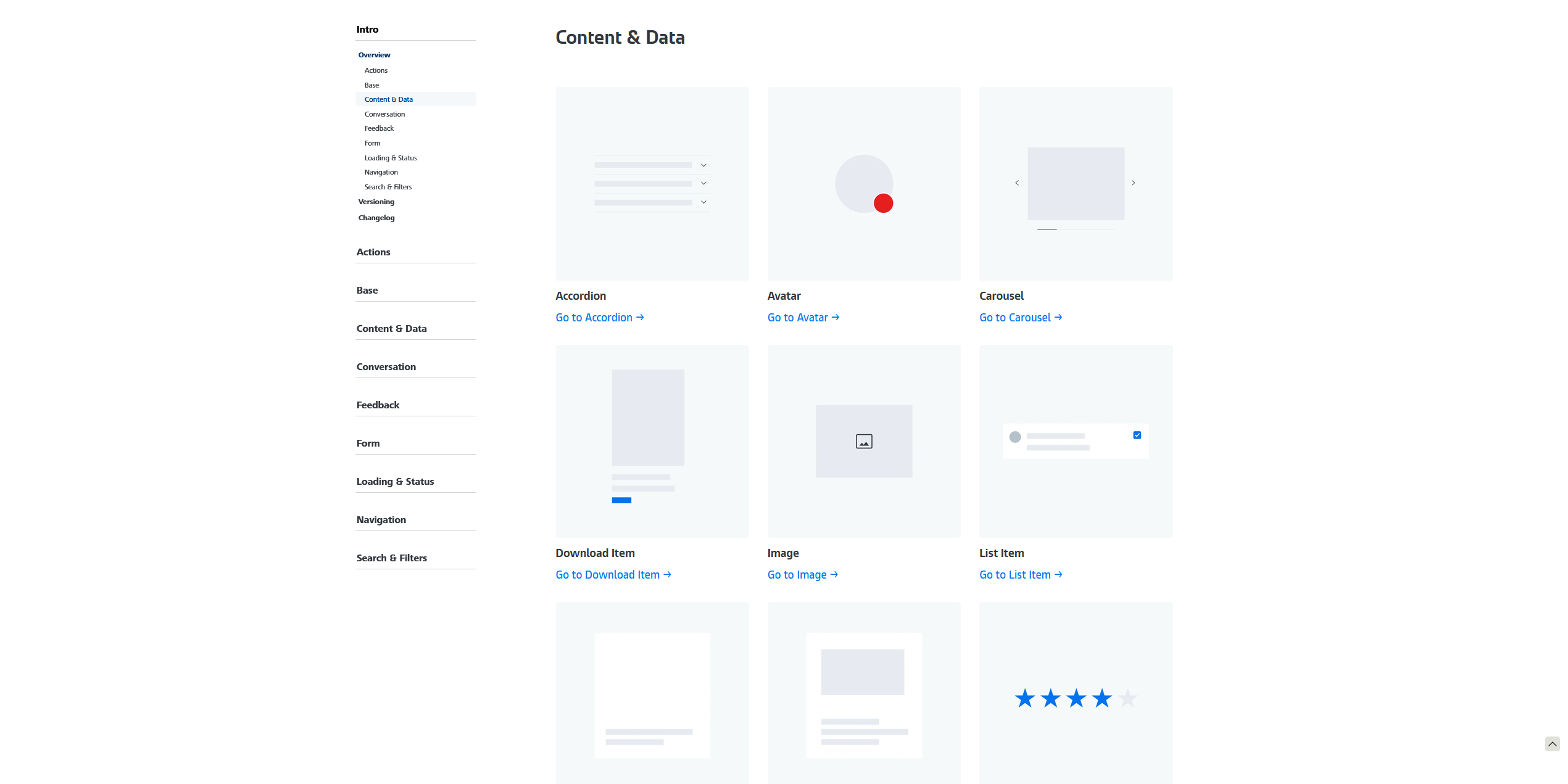
The Beyond for Online Experiences guideline website serves as the central documentation platform for design system components, covering both their visual design and technical implementation. As part of the ZEISS design library transition, existing component documentation from Sketch and Adobe XD was migrated and consolidated into Figma. Each component was enhanced with multiple interactive states and comprehensive documentation to clearly communicate its behavior, usage, and implementation on the guideline website.
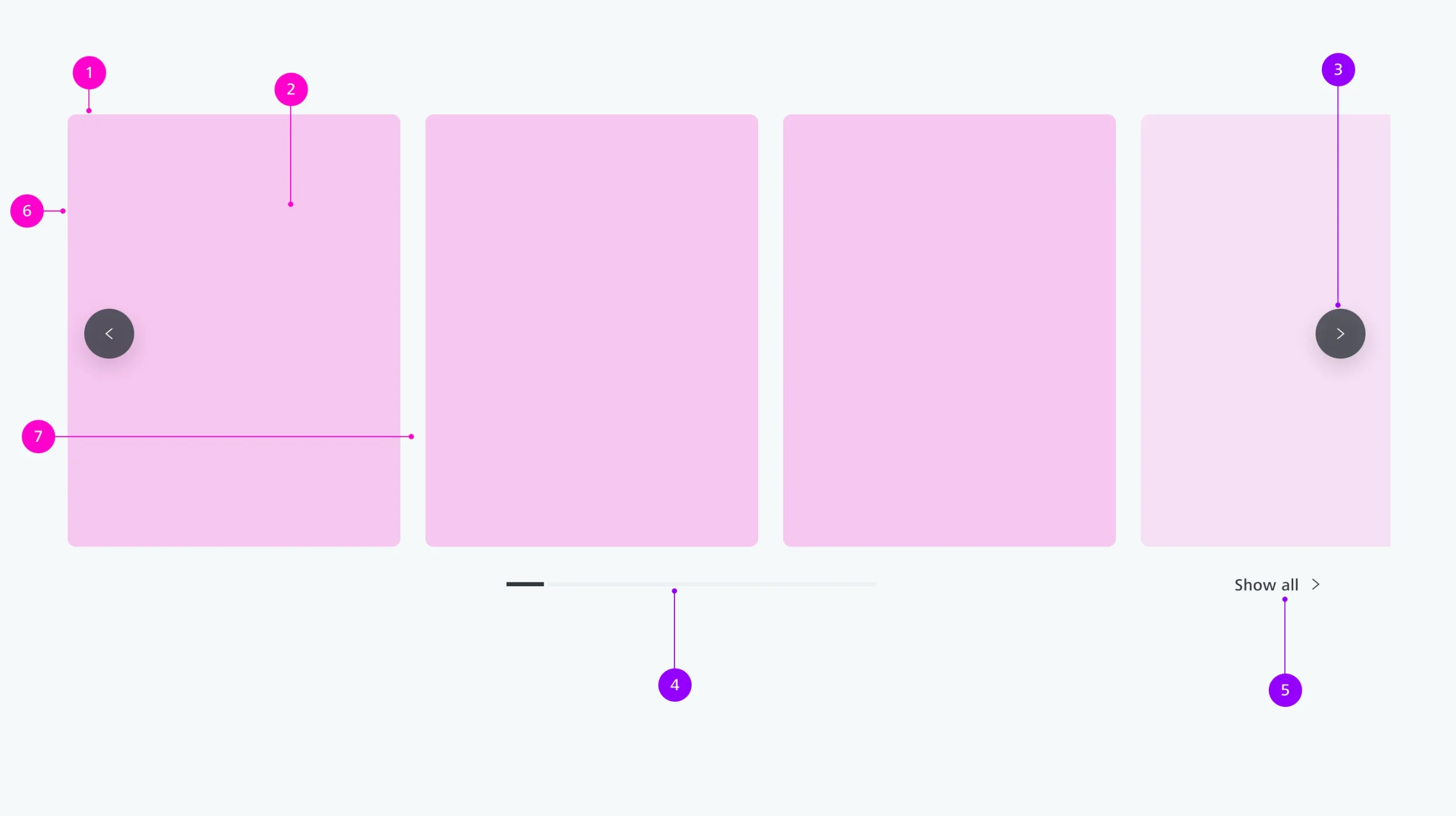
Anatomy visualisation of the carousel component
Interaction design and development review
Components that were redesigned or newly created underwent development reviews to ensure visual consistency, interaction quality, and accurate implementation. Throughout the development process, completed components were reviewed against the original Figma designs, and feedback was provided to developers to resolve any deviations.
For example, the Image Gallery component was enhanced with a new hover interaction that more clearly emphasized the hovered content while subtly de-emphasizing surrounding visual elements, resulting in improved visual hierarchy and user focus.