Corporate design update
2025/2026
As a graphic designer, I worked for MEGA, a German wholesale supplier for food and catering products. During my time there, I updated parts of the company’s corporate design. The goal was to create a stronger and more distinctive visual presence across its established print materials as well as its digital platforms.
Overview
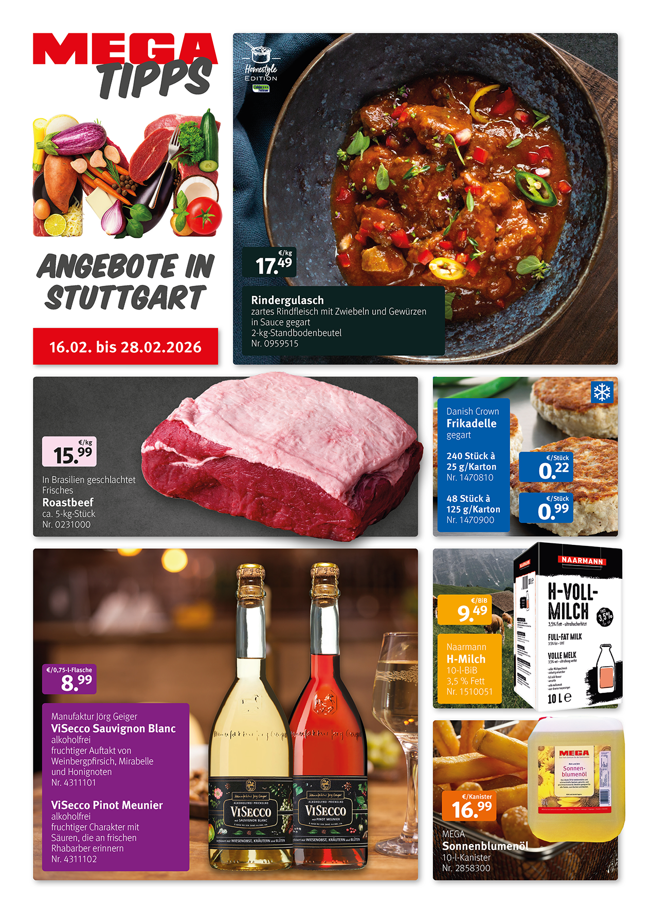
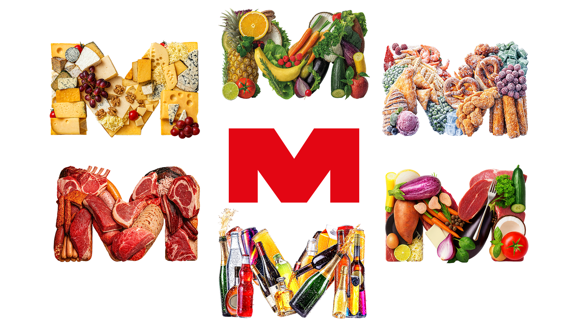
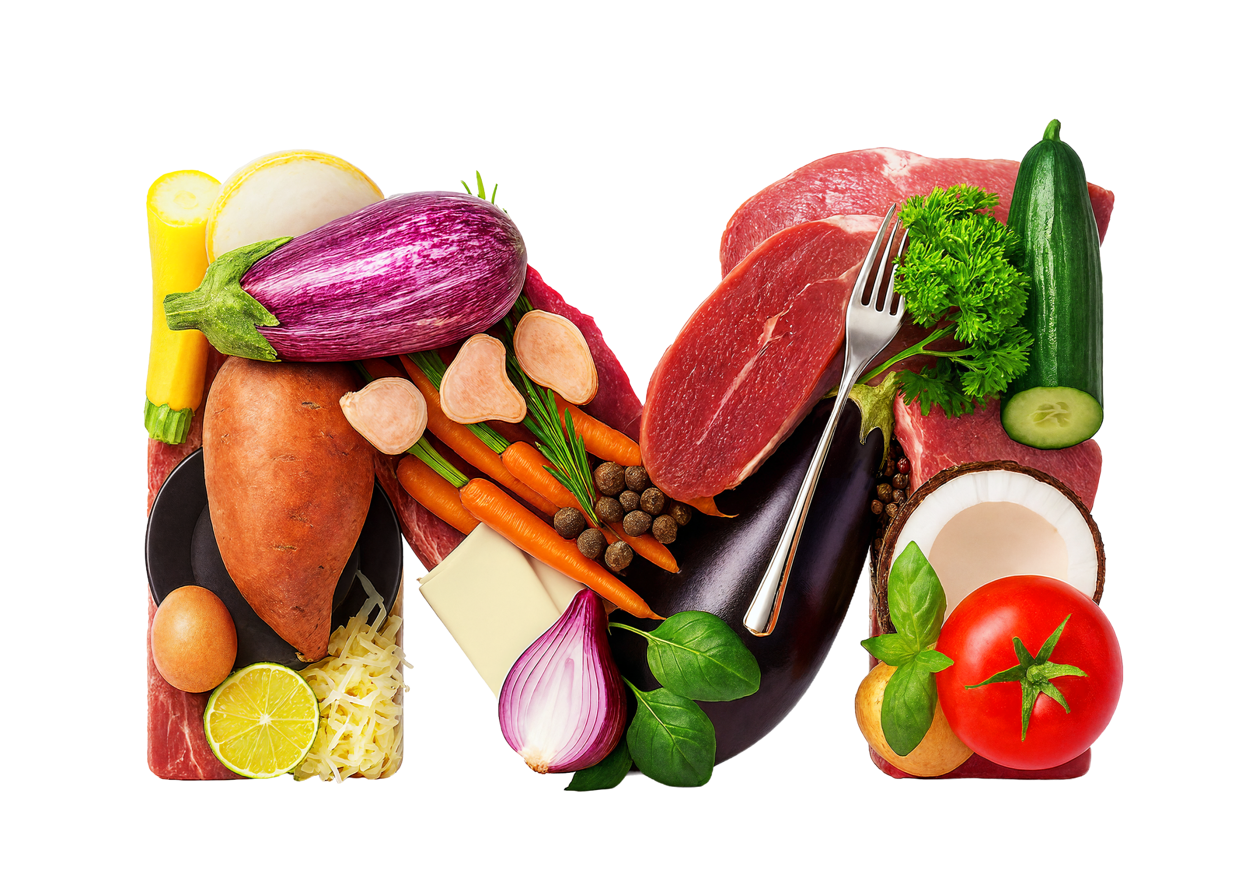
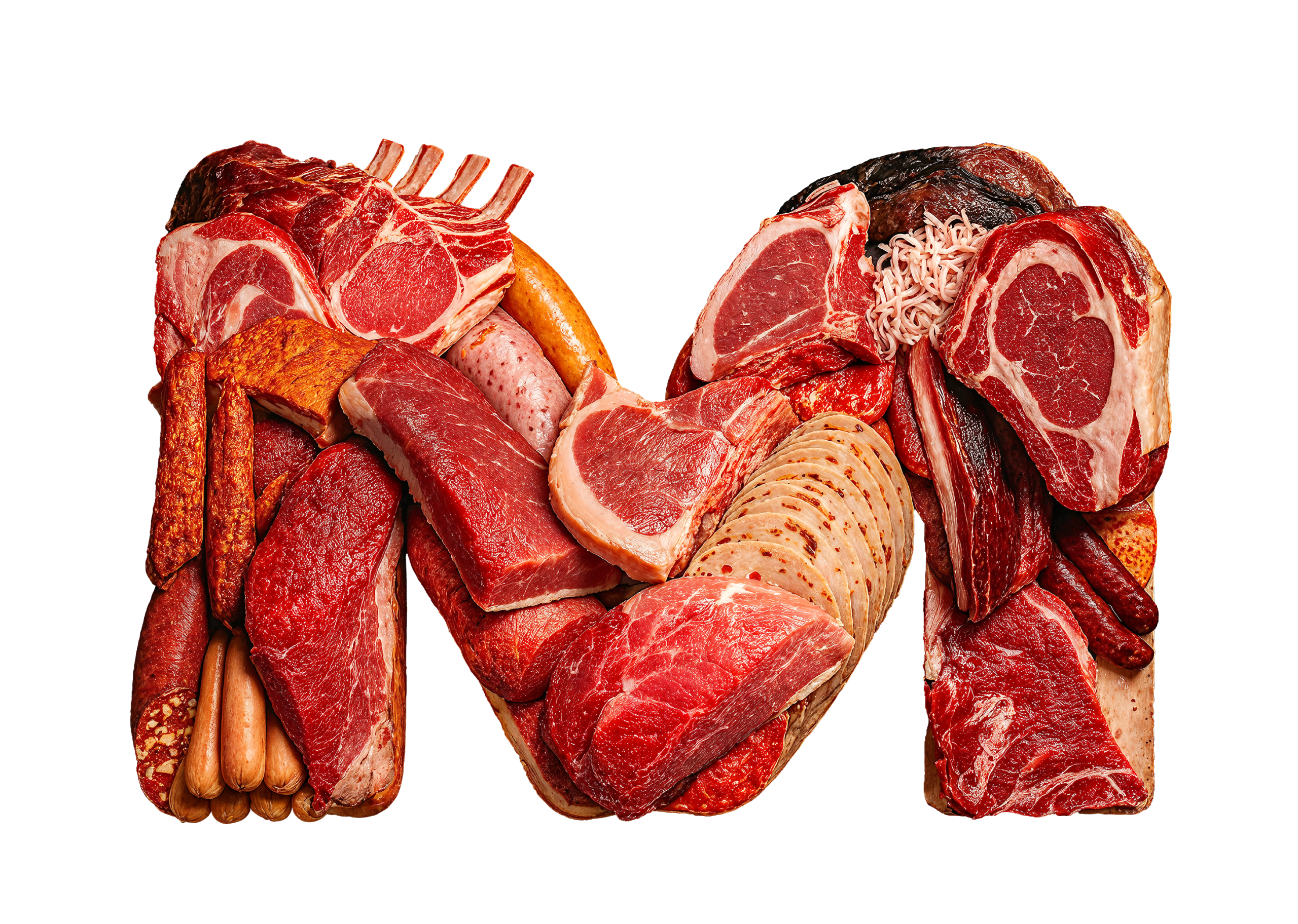
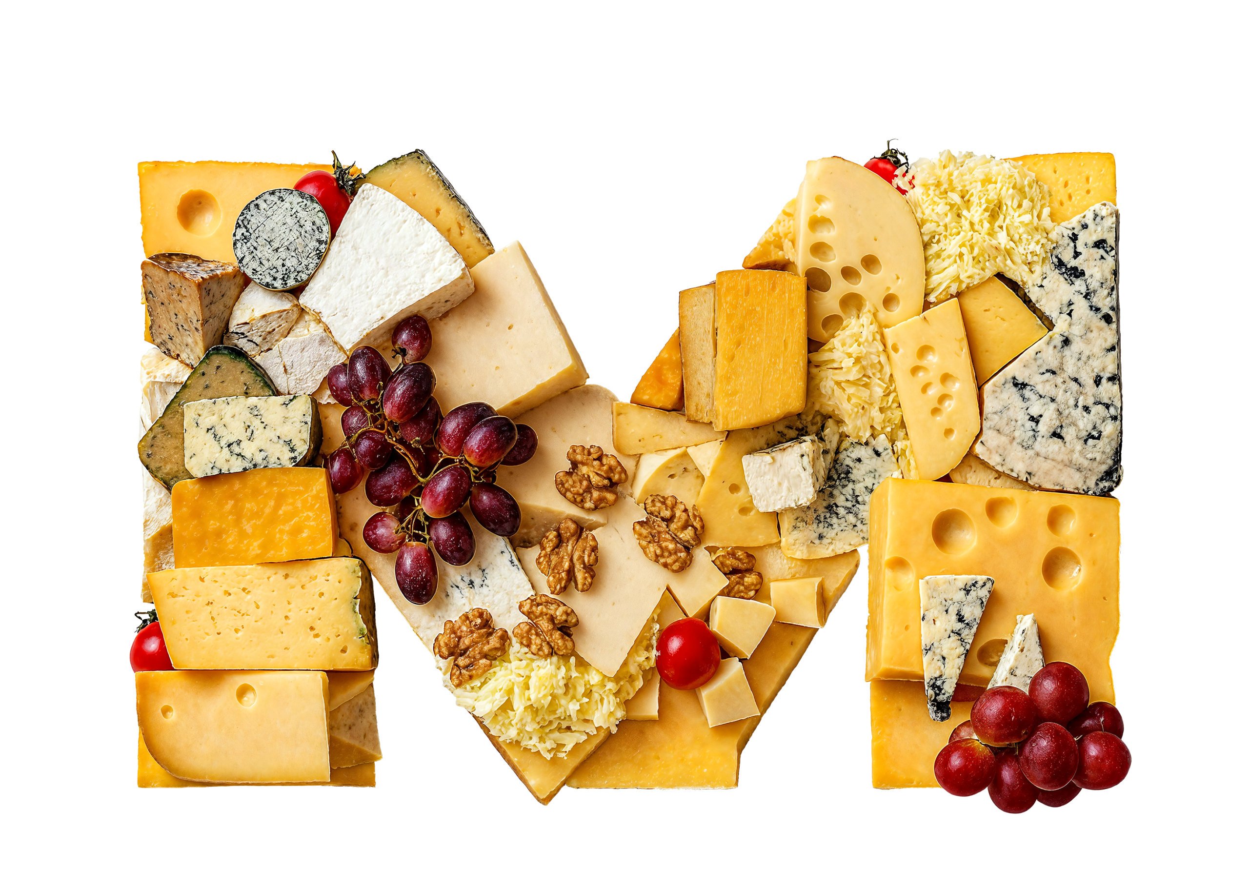
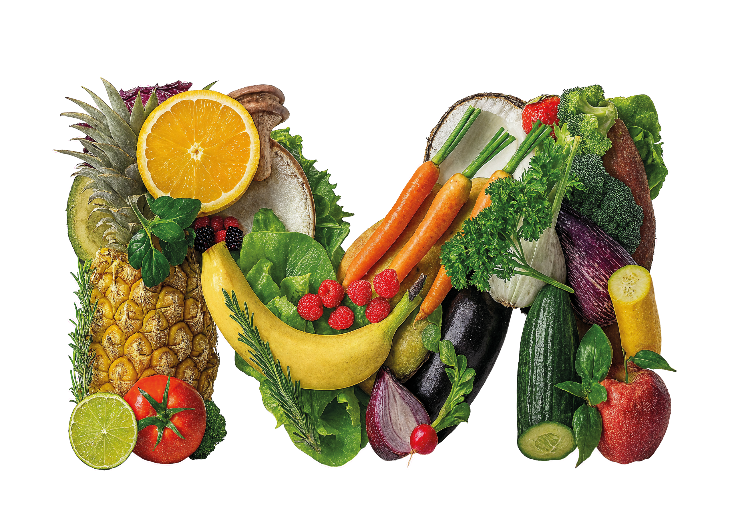
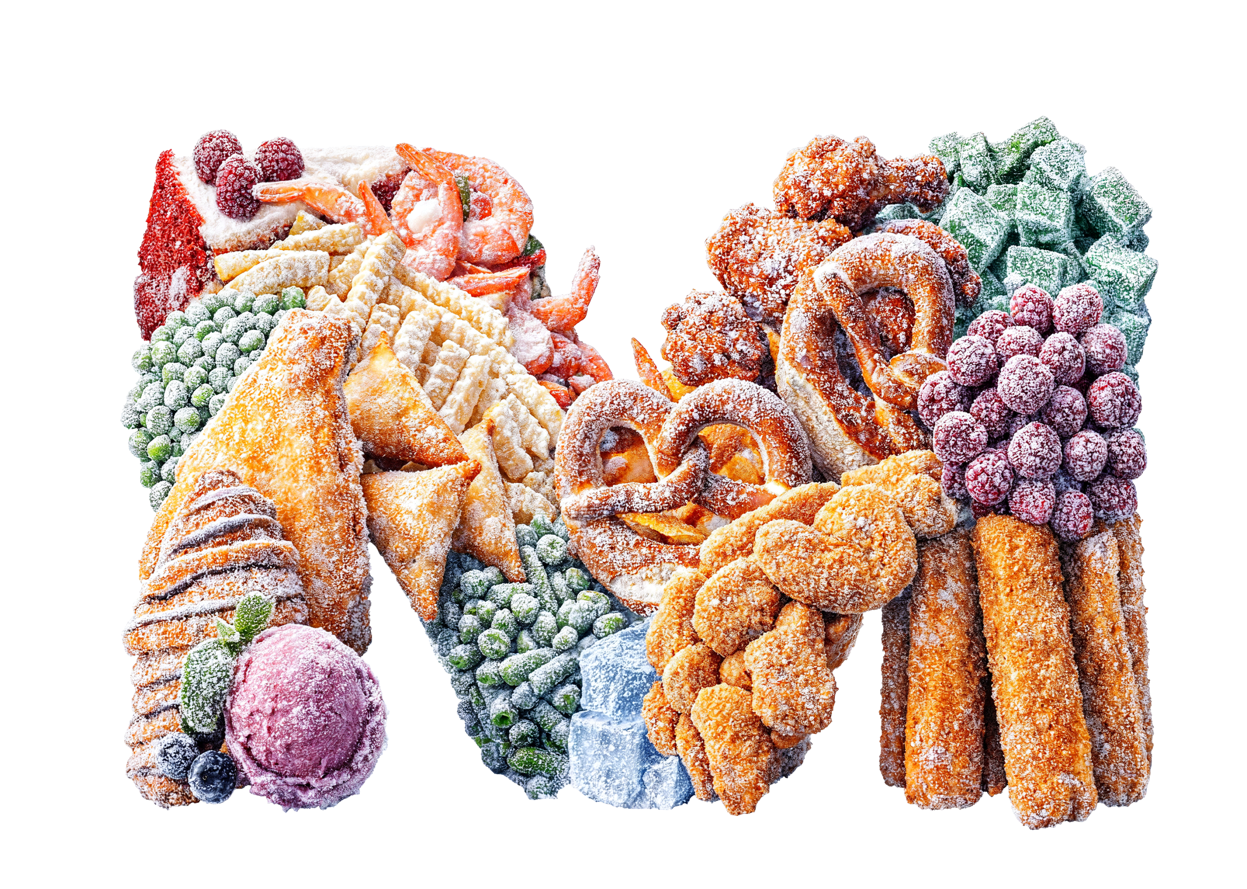
- Key visual: Product illustrations derived from the company logo using category-specific textures to visually represent MEGA’s product range across marketing materials.
- Layout: Developed a new grid system for sales brochures, later adapted for various print and digital materials.
Key visual
To make MEGA’s broad product range more visually tangible, I developed a series of product illustrations that could be used as distinctive graphic elements across marketing materials. Each illustration was based on the “M” from the company logo and enhanced with category-specific textures to represent different areas of the assortment, such as fresh produce, butcher products, and frozen goods. This approach helped create a stronger visual connection between the brand identity and its diverse product offerings.

Layout
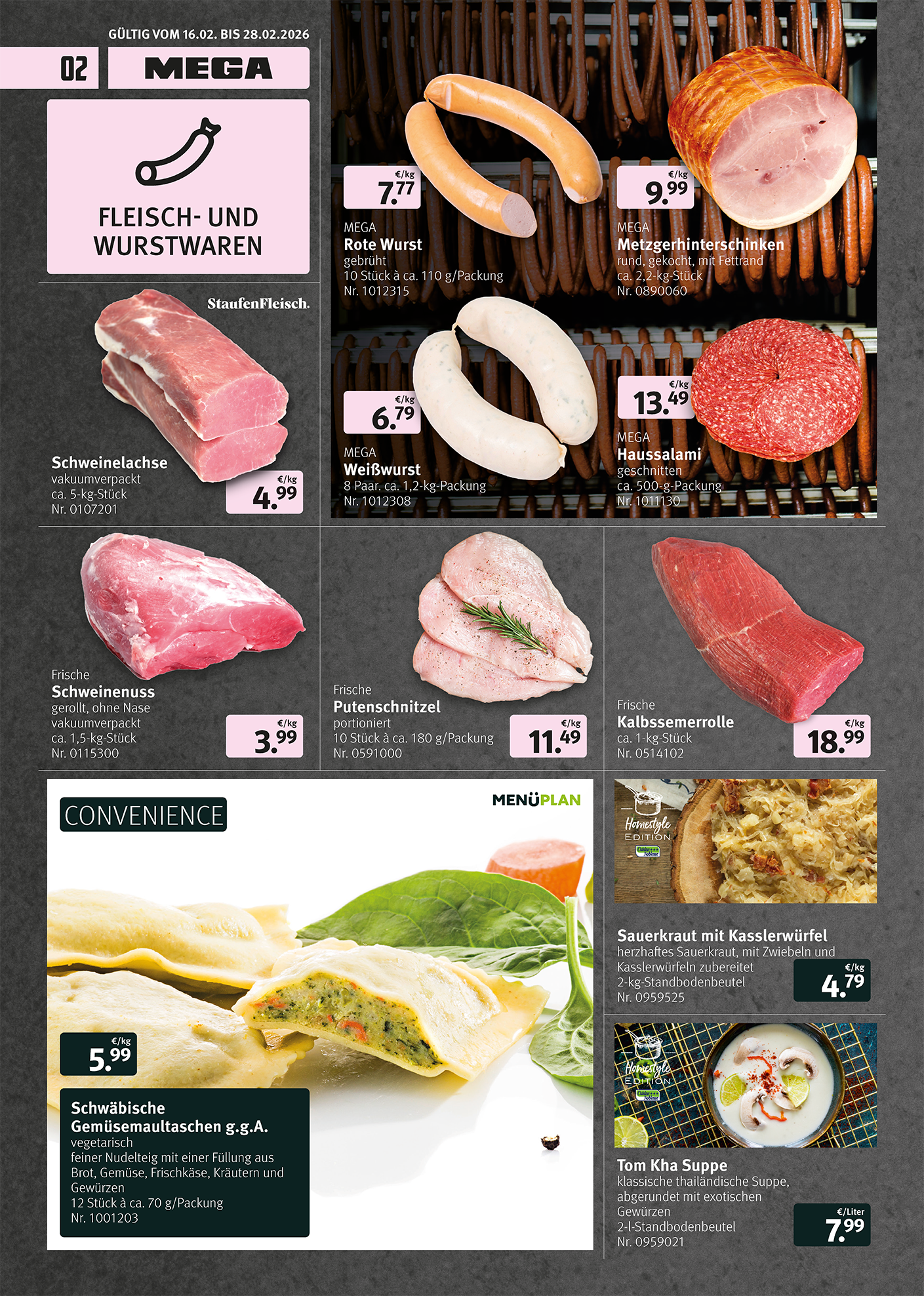
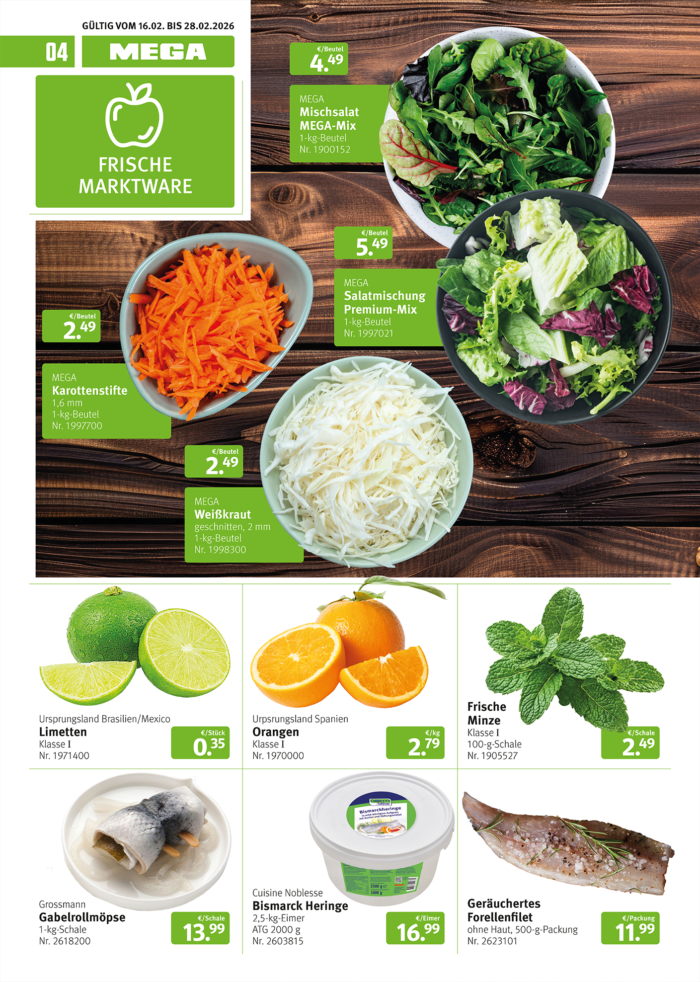
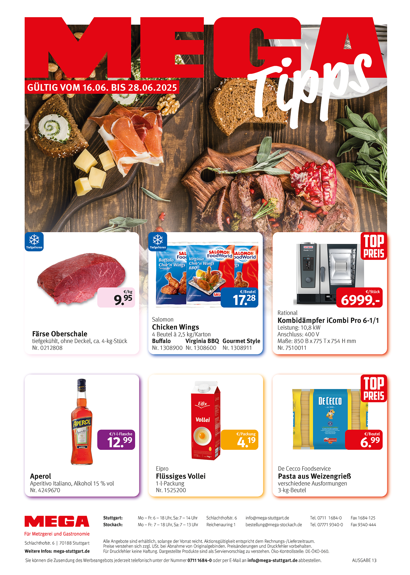
For the biweekly sales brochure, I redesigned the layout to allow for larger product imagery and more efficient use of space. The resulting grid system served as the foundation for updating additional print materials, including postcards, flyers, and posters.
Previous brouchure design
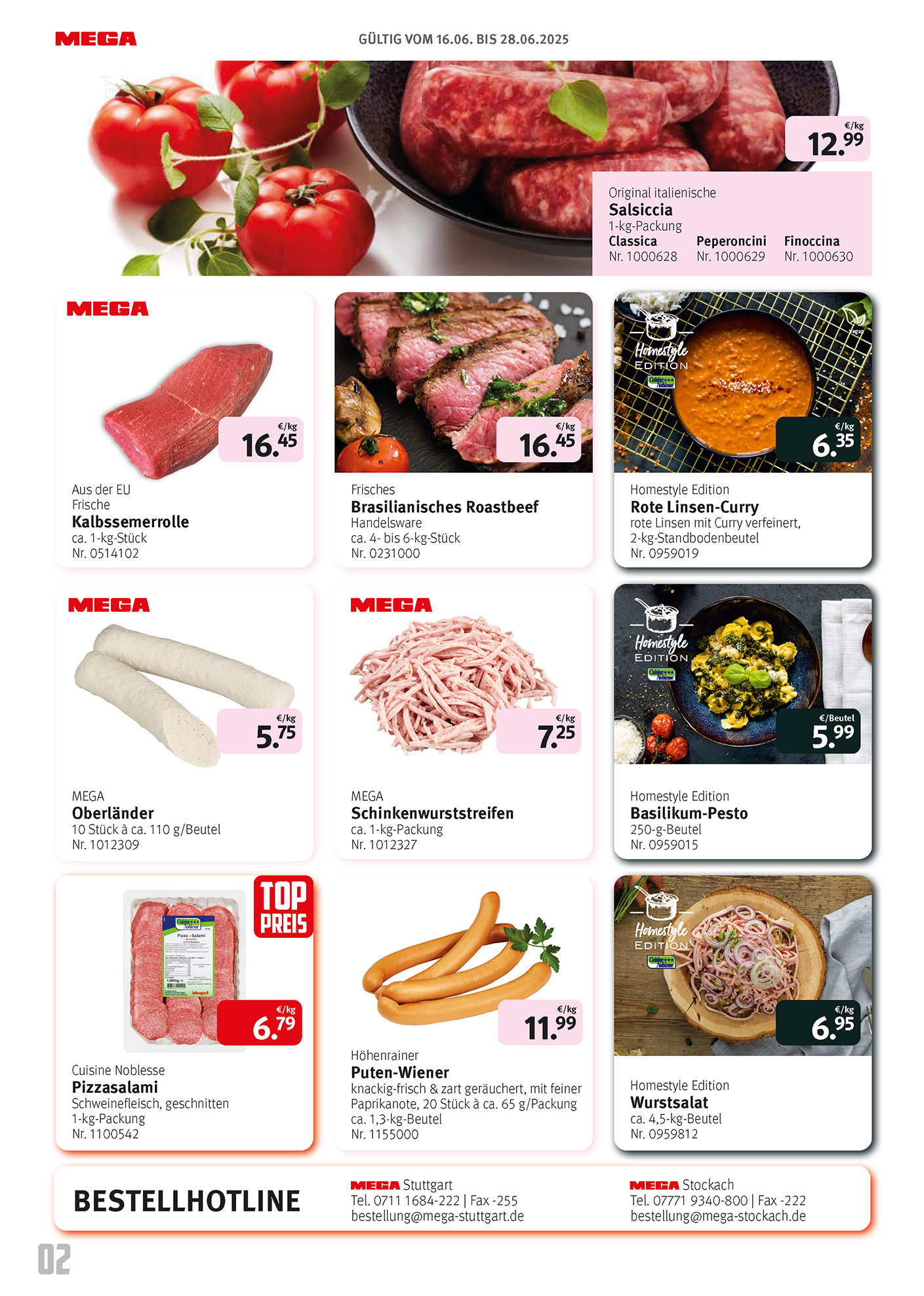
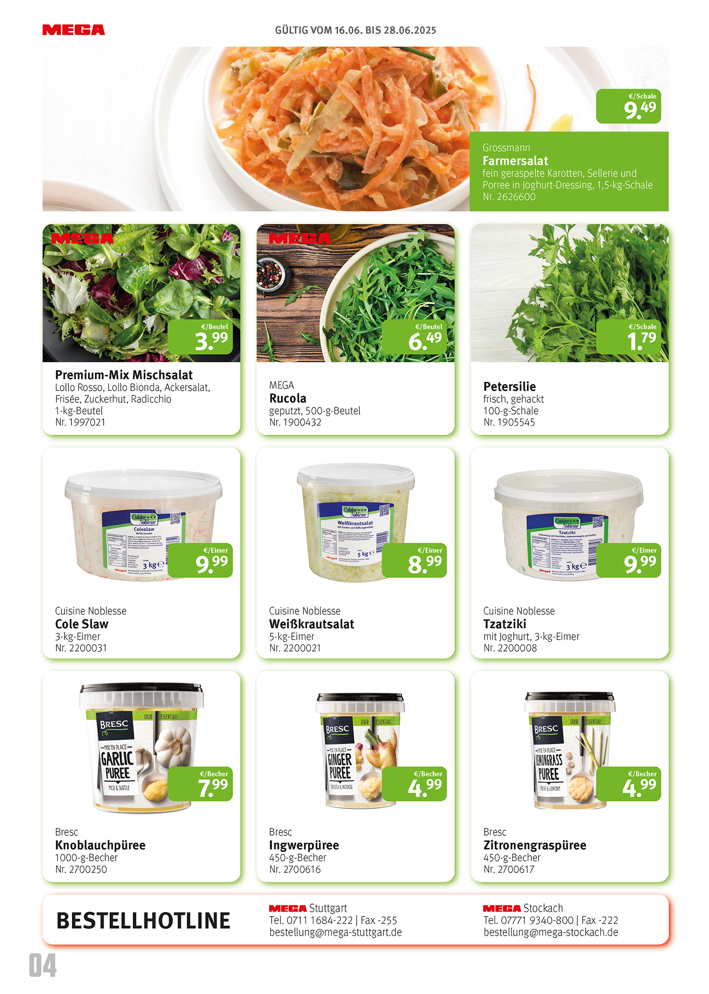
Reworked brouchure design